Jux Typeface
Typeface design
2019
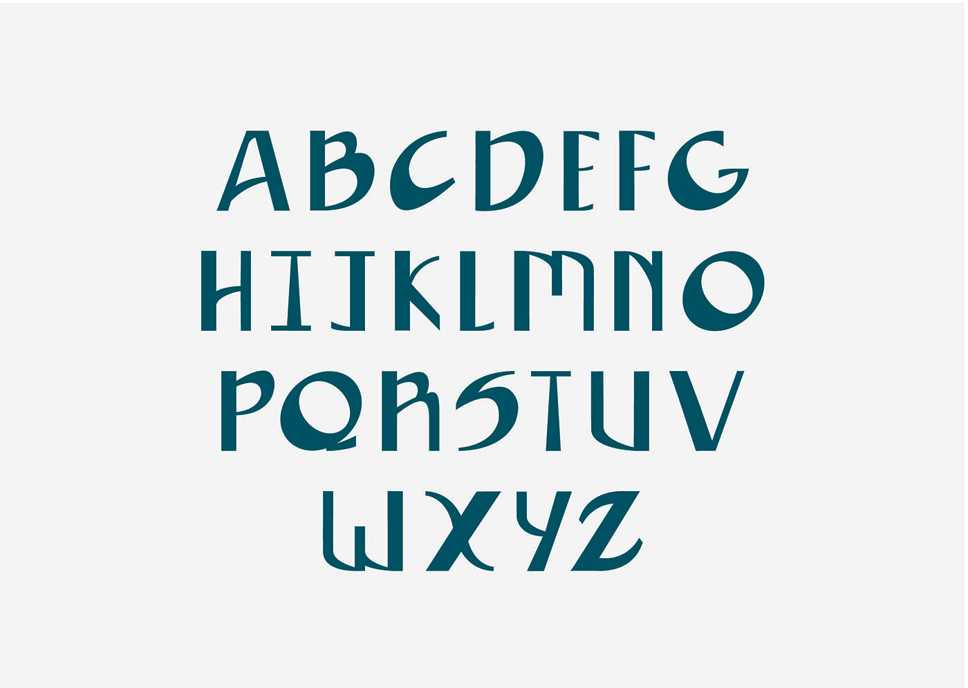
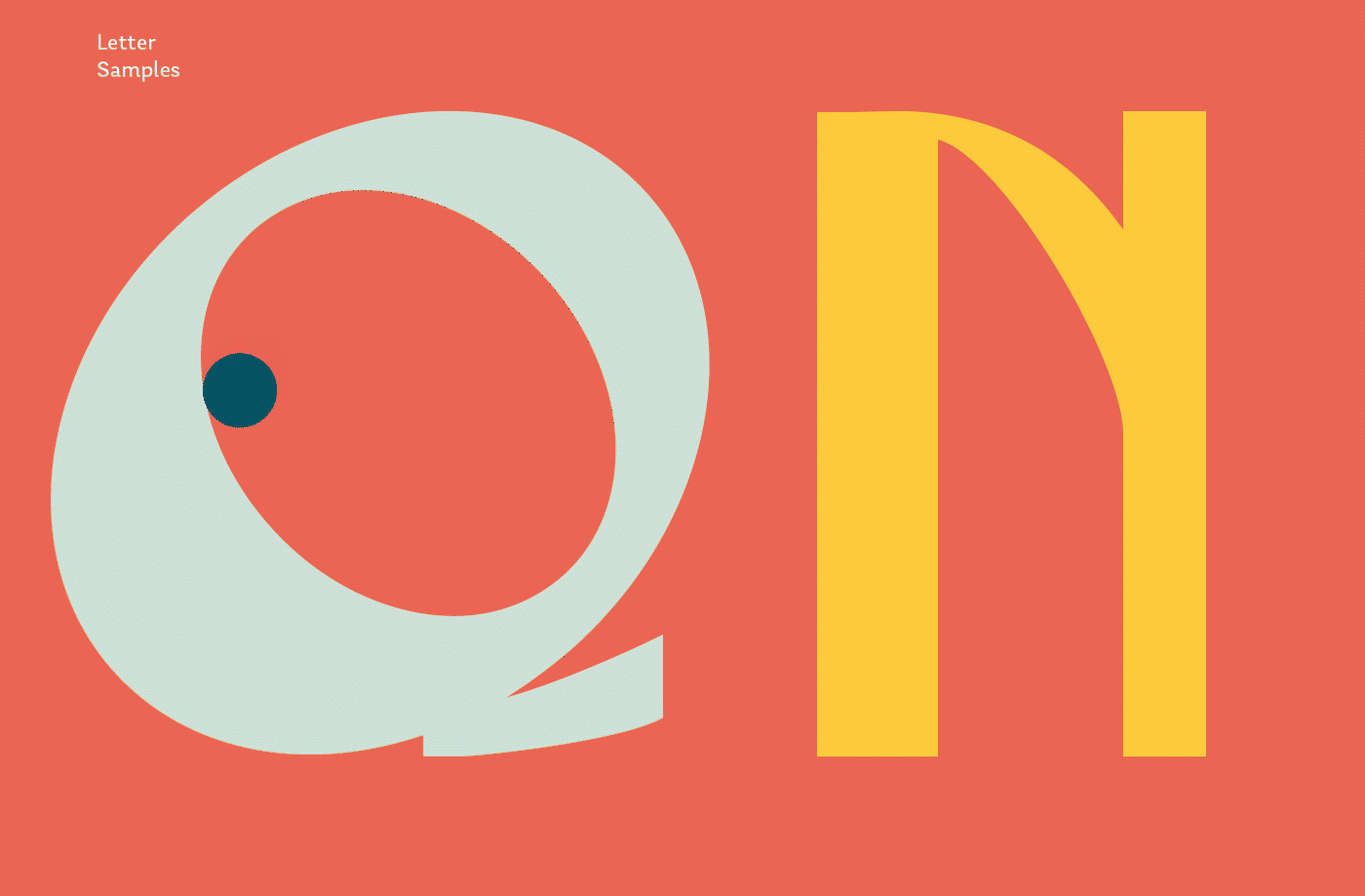
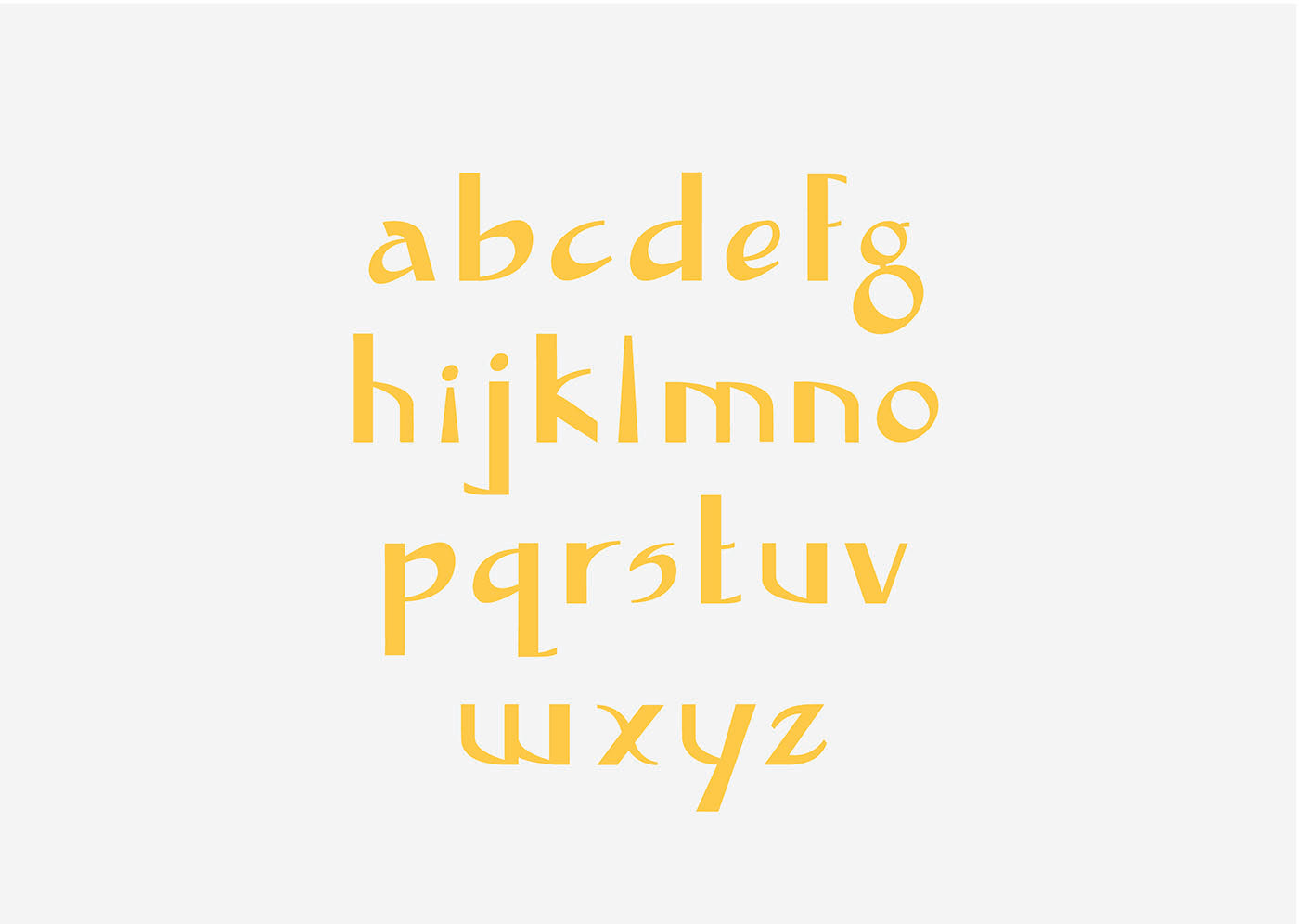
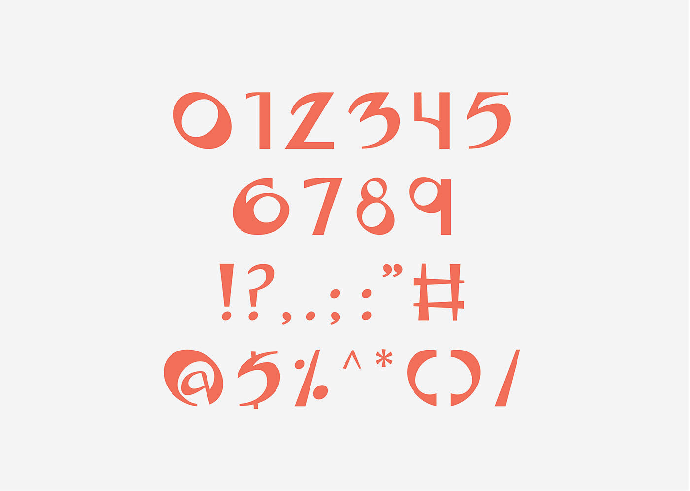
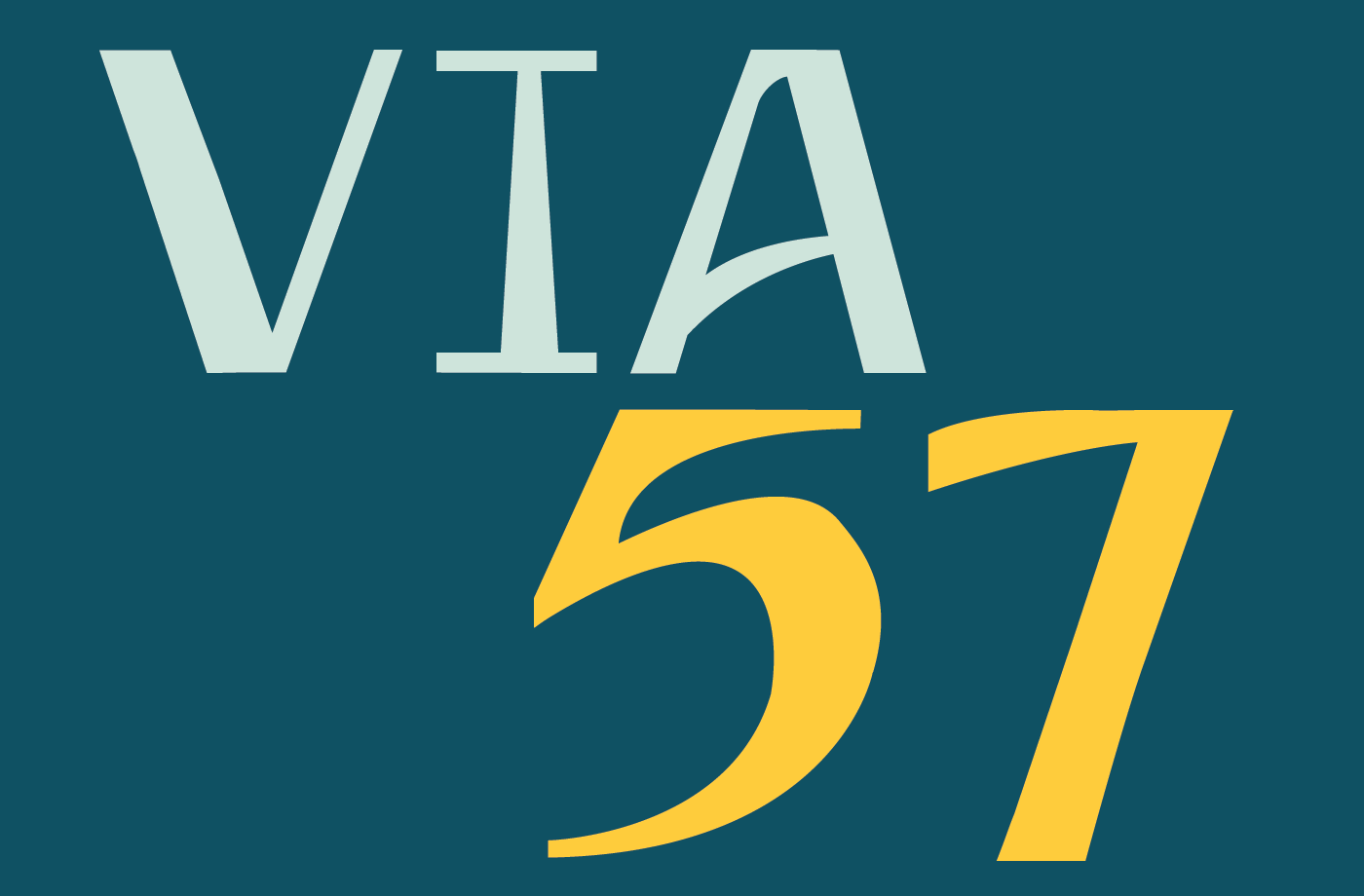
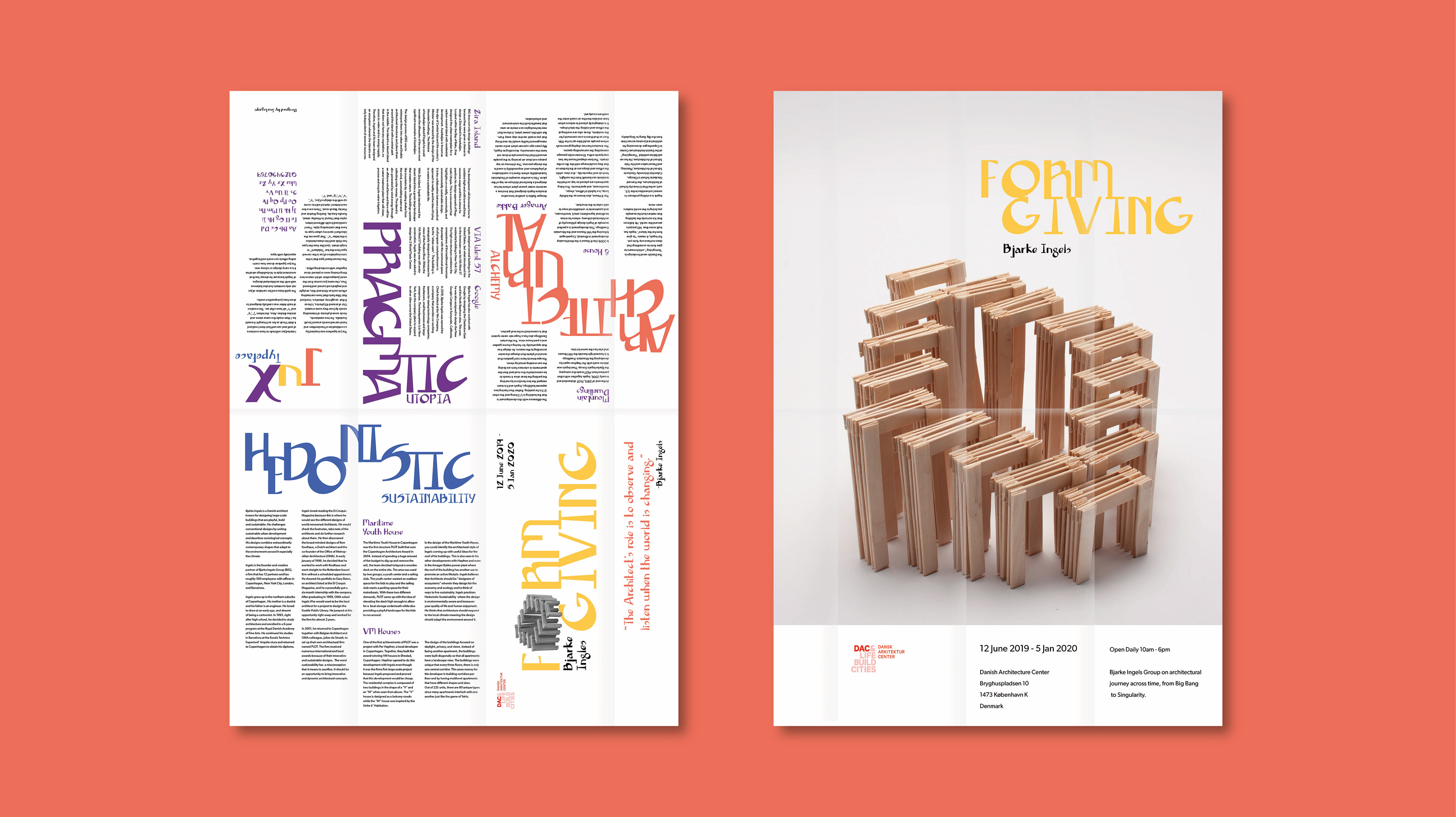
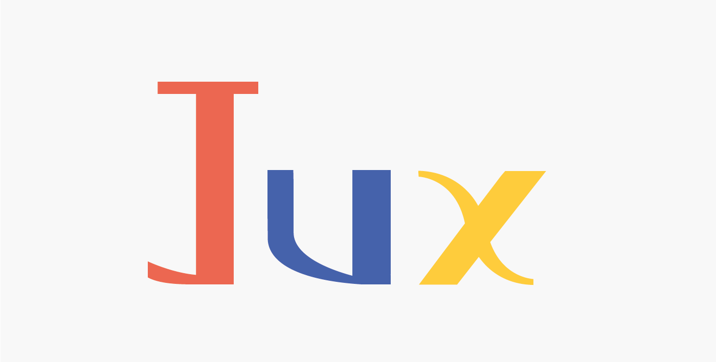
The Jux typeface was inspired by a combination of handwritten and hand-carved words around South Australia. I noticed that I like fonts that have contrasting effects such as thick and thin, straight and
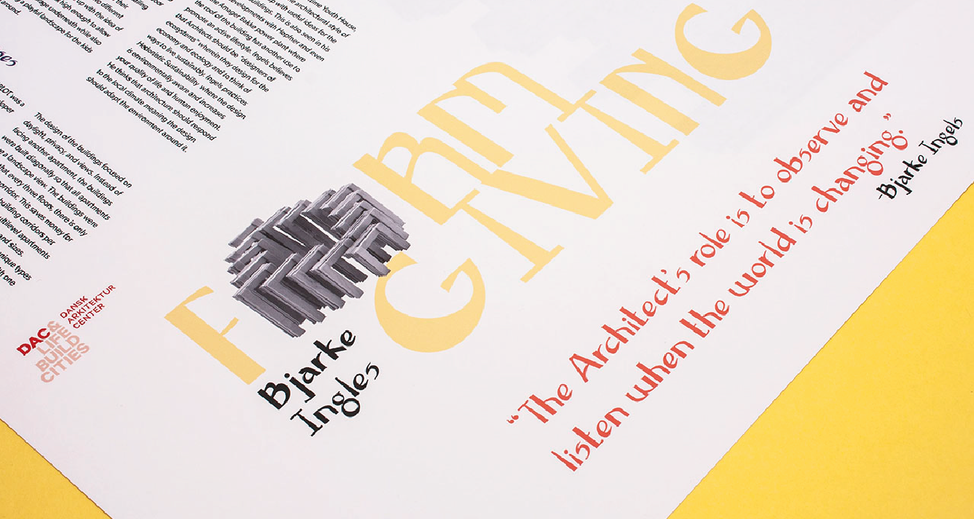
slant and curved and boxed. Thus, coming up with the name Jux from the word Juxtaposition which is two things being seen or placed close together with contrasting effect. This typeface was used in a brochure layout and poster design of an exhibition of Bjarke Ingels, a world-renowned architect.
The creation of each letter was carefully designed to show how juxtaposition works. The quirkiness and fun variation of Jux contrasts and also balances well with the architectural designs of Bjarke Ingels. Ingels has that consistent style when he has a curvy design or a boxy one. The purpose of Jux is to show how contrasting effects can work well together especially with type.